


That being said, one of my personal favorite things is the vernacular that is spoken here. It is almost like an old english type of speaking but with a little bit of a cork to it. It even comes down to the announcements on the tube, with the "mind the gap", "mind your step", all of which come off very proper and respectful. The signage reflects that as well, its very dramatic and serious that it gets its point across. Over the loud speaker in the airport they announced that any unclaimed baggage would be taken and incinerated. But my absolute favorite is the way the people speak hear. It is not just their dialect and the way they pronounce things, its also the word choice. For example, some of my favorite ones were; bloody, wanker, till, take away, litter, toilet, cheers, mate, knackered, cheeky and rubbish, to name a few. The words are something that I think I will take away with me the most. It is quite honestly some of my favorite parts of this adventure.


The design element I chose was the logo for the Arsenal Football team. I chose this one because honestly I liked it however I chose it mostly because it had an example of a lot of things we are told to never to do as designers. So I found it interesting that something so large and prominent in the UK featured what some would consider not the best design. The design features an outline type face as the header, which is something we have been taught to consider a little more on the tacky side and to avoid it unless it compliments the design. It also has a cannon as its main focal point for the logo. But both of its ends are bleeding into the edges of the shield, which again is something we are constantly taught to stray away from unless absolutely necessary or intentional. However something I did find interesting was that they constantly fluctuated with their advertising. Switching on and off between their black and white logo and their color one.

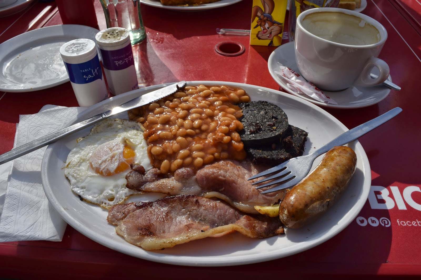
This lovely London day started off right with a traditional English breakfast. Much better than the jam and toast for every other day this week. I of course decided to order everything on the menu at once. This included your typical eggs, bacon, sausage, toast, and hash browns. But the surprising elements were fried tomatoes and mushrooms with something called black pudding. Black pudding is cooked pigs blood in a natural stomach casing. This part was only enjoyed by myself and my sister Eden. It had a slightly gritty texture that tasted metallic but overall was pretty tasty. It was all topped off with an english breakfast tea, fitting, yes I know. It was milder than most teas I was used to, with lots of milk, which in England, has no preservatives or added cultures, this made all their dairy products taste exceptional. Overall, the meal was to die for. In fact I had it a second time later that night for dinner.


Anyway thats all for now, cheers from Matt-stache and Matty Ramz.

No comments:
Post a Comment